
Year
2020
Client
Fourier Enterprises
Category
Portfolio
Product Duration
3 - 4 Weeks
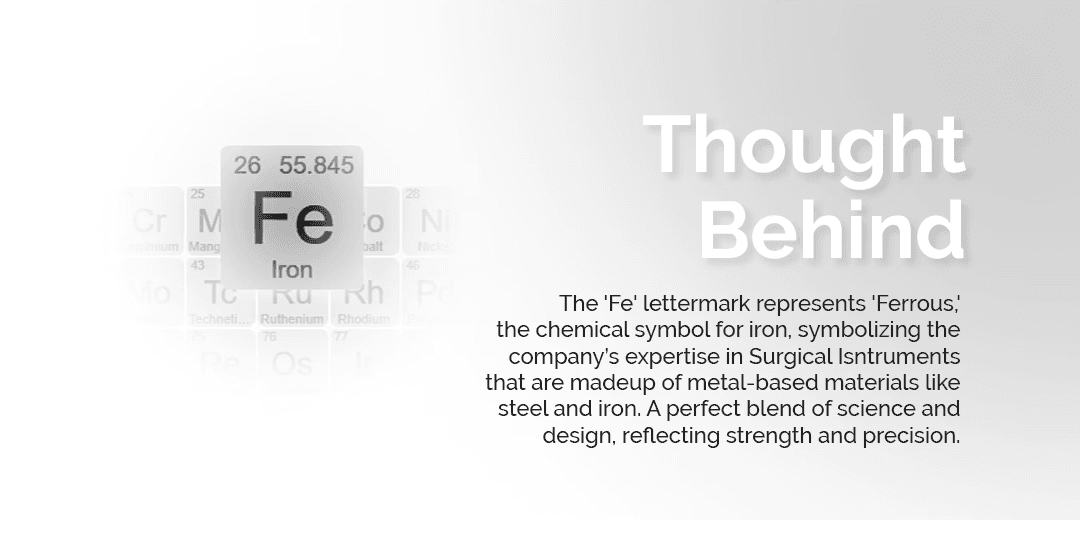
We began by understanding the client’s domain—surgical instruments made from metal-based materials. Our research focused on identifying a concept that could visually reflect strength, precision, and a technical identity. We explored scientific symbols, chemical elements, and industry-specific language to ensure the branding aligned with the company's core values and area of expertise.
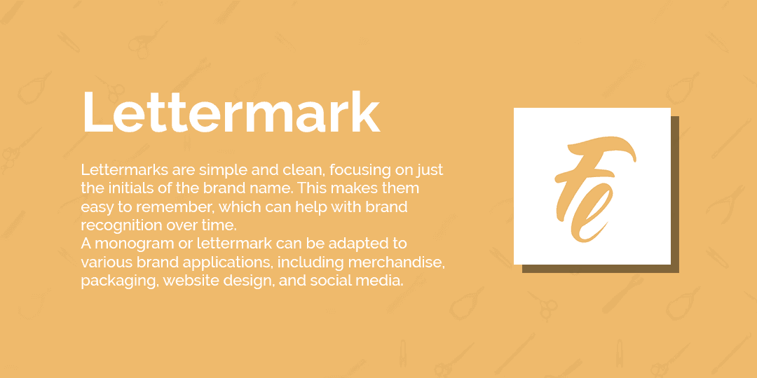
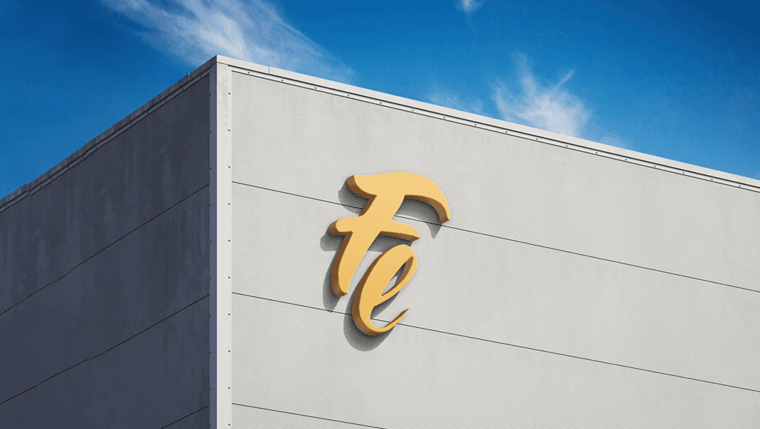
The final concept uses the chemical symbol "Fe" for Iron, which stands for ‘Ferrous’, a perfect nod to the company’s metal-focused craft. By choosing a letter mark, we created a clean and adaptable identity. The minimalist approach ensures versatility across various applications while the deeper symbolic layer strengthens brand recognition and meaning.
We designed and developed a clean, responsive website for Fourier Enterprises that reflects their legacy of precision and professionalism in surgical instrument manufacturing. The site emphasizes user-friendly navigation, clear structure, and modern visuals to showcase their expertise and support global client engagement.


